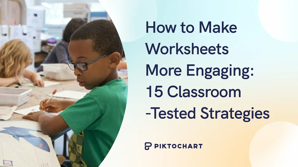
Take a look at the two posters below. Which one would you trust the most?

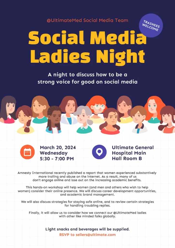
If you opted for the second one (Social Media Ladies Night poster), it’s likely because of unity— a principle of design that transforms amateur work into professional graphic design.
Unity is what makes everything click. It makes a random collection of elements into a cohesive, professional design that actually makes sense.
Keep reading to learn exactly what unity is and how to achieve it in your own design work!
What is the unity principle of design?
Unity is the principle of design that brings all elements within a composition together to create a harmonious whole.
Think of decorating your home. You wouldn’t put a neon pink modern couch in a rustic farmhouse living room with wooden beams and vintage furniture. Everything needs to share a common theme, color palette, and style.
Unlike other design principles, unity doesn’t come with strict rules or defined guidelines. Instead, it unites all the other design principles within a composition to create a cohesive whole. Without unity, your design feels scattered and unprofessional.
Quick formula to achieve design unity
Before diving deeper into understanding unity, here’s a practical formula you can apply immediately to achieve unity in any design project. This formula works for 90% of design projects. It includes colors, typography, spacing, and alignment.
Colors: The 60-30-10 rule
This classic design principle creates balanced, visually appealing color schemes by dividing your palette into three proportions. Here’s an example of a poster following the 60-30-10 rule when it comes to colors.

60% Dominant color (usually neutral)
- This is your canvas—typically white, off-white, light gray, or your background color
- Creates breathing room and doesn’t compete for attention
- Example: White backgrounds, light gray sections
30% Secondary color (supports the dominant)
- Your main brand color or primary content color
- Used for headers, important sections, main UI elements
- Example: Navy blue for headers and key sections
10% Accent color (creates interest)
- Your call-to-action color, highlights, links
- Should contrast with other colors for emphasis
- Example: Bright blue or orange for buttons and links
Recommended reading: The Complete Guide to Color Psychology
Typography: The two-font maximum
Limit yourself to just two fonts to create clean, professional designs that don’t overwhelm your readers. Here’s a good example of a LinkedIn graphic following the two-font maximum.

Font 1: Headlines and emphasis
- Choose something with personality but still readable
- Use different weights (bold, semibold) for hierarchy
- Example: Montserrat, Playfair Display, or Inter Bold
Font 2: Body text and supporting content
- Prioritize readability over personality
- Should complement, not compete with, your headline font
- Example: Open Sans, Roboto, or Inter Regular
Size hierarchy formula
- H1: 2.5x base size (40px if base is 16px)
- H2: 2x base size (32px)
- H3: 1.5x base size (24px)
- Body: 1x base size (16px)
- Small text: 0.875x base size (14px)
Recommending reading: 4 Things You Need to Know to Pair Fonts Well
Spacing: The 8-point grid system
Use 8px as your base unit, then multiply by whole numbers (1x, 2x, 3x, etc.) to create all your spacing values. This system creates consistency across your entire design.
Base unit: 8px (industry standard)
- Scales perfectly on all screens
- Divides evenly into common screen sizes (320px, 768px, 1024px, etc.)
- Creates natural visual rhythm
- Aligns with how most CSS frameworks and design systems work
Spacing scale:
- Micro space: 8px (between related items like icon and text)
- Small space: 16px (between elements like form fields)
- Medium space: 24px (between sections like cards in a grid)
- Large space: 32px (major sections like header and main content)
- Extra large: 48px or 64px (page sections like footer separation)
Application examples:
- Button padding: 8px vertical, 16px horizontal
- Paragraph spacing: 16px
- Section margins: 48px
- Card padding: 24px
Alignment: Pick one system
Choose your alignment strategy and stick to it throughout your design. Consistency in alignment creates visual order and makes your content easier to follow.
Pro tip: Never mix alignment systems on the same page (unless you’re creating intentional contrast).
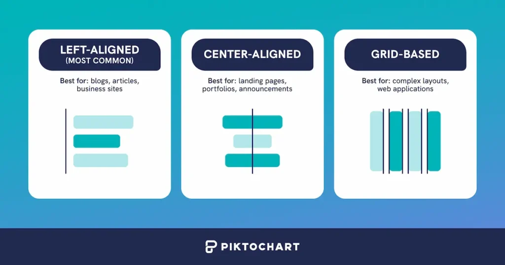
Option 1: Left-aligned (most common)
- Creates strong visual starting point
- Natural for reading (in Western cultures)
- Easy to maintain across different screen sizes
- Best for: blogs, articles, business sites
Option 2: Center-aligned
- Creates formal, balanced feeling
- Works well for short content
- Can be harder to read in long paragraphs
- Best for: landing pages, portfolios, announcements
Option 3: Grid-based
- Most flexible and professional
- 12-column grid for web (divisible by 2, 3, 4, 6)
- Elements snap to grid lines
- Best for: complex layouts, web applications
What to avoid:
- Mixing center and left alignment randomly
- Different grid systems on the same page
- Changing alignment without purpose
Watch the short tutorial below on how to create a grid using Piktochart.
Putting it all together: A 5-minute implementation for unity in design
Now that you understand the individual principles, here’s how to apply them all at once to create a cohesive design. This quick checklist will transform scattered elements into a unified, professional-looking project that feels intentionally designed rather than thrown together.
1. Define your system (2 minutes)
- Pick your 3 colors and assign percentages
- Choose your 2 fonts
- Commit to 8px grid
- Decide on alignment
2. Create your brand style guide (2 minutes)
A brand style guide is your design rulebook—it keeps everything consistent across your project. Think of it as your design DNA that ensures every element feels like it belongs together.
Here’s a simple template to get you started:
Colors (60-30-10 rule)
- Primary (60%): #FFFFFF – Your main background color that covers most of your design
- Secondary (30%): #1A1A1A – Your primary content color for text and major elements
- Accent (10%): #0066FF – Your pop of color for buttons, links, and highlights
Typography (two-font maximum)
- Headlines: Inter Bold – For titles, headers, and anything that needs emphasis
- Body text: Inter Regular – For paragraphs, descriptions, and readable content
Spacing (8px grid system)
Use multiples of 8px for all spacing: 8px, 16px, 24px, 32px, 48px, etc.
Alignment
Left-aligned text with 12-column grid layout for organizing content
Pro tip: Templates are your shortcut to professional unity. How? Someone has already solved the visual hierarchy, spacing, and color harmony for you.
Instead of spending hours tweaking alignment and wondering if your colors work together, you can focus on your actual content while the template handles the design consistency automatically.
Understanding visual vs. conceptual unity
Think of unity as happening in two dimensions: what your design looks like and what it communicates.
Visual unity is about making everything look like it belongs together, while conceptual unity ensures your message is clear and consistent. Unity works on two levels that complement each other to create truly cohesive designs.
Visual unity
Visual unity deals with the physical design elements—using similar shapes, colors, textures, and fonts to create a cohesive look through:
- Consistent color palettes
- Repeated shapes and patterns
- Uniform typography
- Aligned visual elements
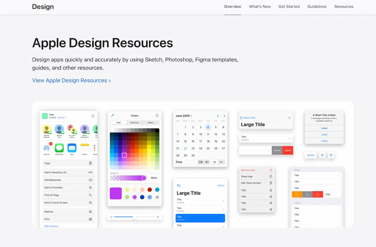
Apple’s design system demonstrates this perfectly with its minimal approach, consistent San Francisco font, rounded corners throughout iOS, and silver, space gray, and white color scheme.
Conceptual unity
While visual unity focuses on appearance, conceptual unity focuses on the message and theme. This involves using elements and design choices that support and reinforce the central idea.
National Geographic exemplifies conceptual unity where every element reinforces exploration and discovery through their iconic yellow border frame, documentary photography style, and educational, authoritative tone.
How unity enhances other design principles
Unity is unique among design principles because it doesn’t add new elements. Instead, it ensures all existing elements work as one. Here’s how unity amplifies each principle:
Unity + Balance = Cohesive stability
A design can be perfectly balanced yet still feel disjointed if elements don’t share common characteristics. Unity ensures balanced elements feel related, creating both visual stability and conceptual coherence.
Unity + Contrast = Purposeful emphasis
Contrast without unity often feels chaotic. Unity provides the consistent foundation that makes contrast meaningful—like a bold color that stands out because everything else follows a muted palette.
Recommended reading: A Complete Guide To Contrast In Design
Unity + Movement = Natural flow
Unity creates visual connections between elements, making movement feel smooth and logical rather than forced. It’s the difference between a clear path and a confusing maze.
For these reasons, unity acts as the master design principle because it determines how effectively all other principles work together.
Why unity matters the most in design
Unity is arguably the most important principle of design because it guides how to best leverage all other principles. Here’s why it’s essential:
1. It creates professional credibility
A unified design appears polished and intentional, which builds trust instantly. Consider two websites: one with inconsistent fonts, random colors, and misaligned elements versus another with cohesive typography, harmonious colors, and grid-based layout. The unified site immediately establishes credibility.
2. It enhances user experience
Consistency in design elements like navigation bars, buttons, and fonts ensures users have a seamless interaction. When users don’t have to relearn your interface, they can focus on your content.
3. It strengthens message clarity
When all elements work together, your message comes through clearly. Unity eliminates visual noise that distracts from your core communication, making your content more effective.
Essential elements of design unity
Understanding the core elements that create unity helps you build more cohesive designs systematically. These elements work together, often simultaneously, to create the unified experience your audience expects.
1. Color harmony
Your color choices are the fastest way to create or break unity. Limit yourself to 3 to 4 colors maximum, use the 60-30-10 distribution rule, and ensure colors relate to each other through temperature, saturation, or value. Even when using contrasting colors, they should feel intentionally chosen rather than random. Learn how to be more intentional with color palettes.
2. Typography consistency
Stick to your two-font maximum religiously. Use font weights and sizes to create hierarchy, but never introduce a third font family “just this once.” Your typography should support readability while reinforcing your design’s personality consistently across all elements.
3. Spatial relationships
Consistent spacing creates invisible connections between elements. Use your 8px grid system for all margins, padding, and gaps. When elements follow the same spatial rules, they automatically feel related even when they serve different functions.
4. Visual style coherence
All visual elements—icons, images, illustrations, buttons—should share similar characteristics. If you use rounded corners, use them everywhere. If your photos are bright and airy, don’t mix in dark, moody images. Style consistency signals professionalism.
5. Alignment structure
Strong alignment creates order and relationships between elements. Whether you choose left-aligned, center-aligned, or grid-based alignment, apply it consistently. Mixed alignment systems within the same design create chaos and break unity.
Keep in mind that these elements of design unity work best when applied together rather than in isolation. Master one element at a time, then combine them for maximum impact.
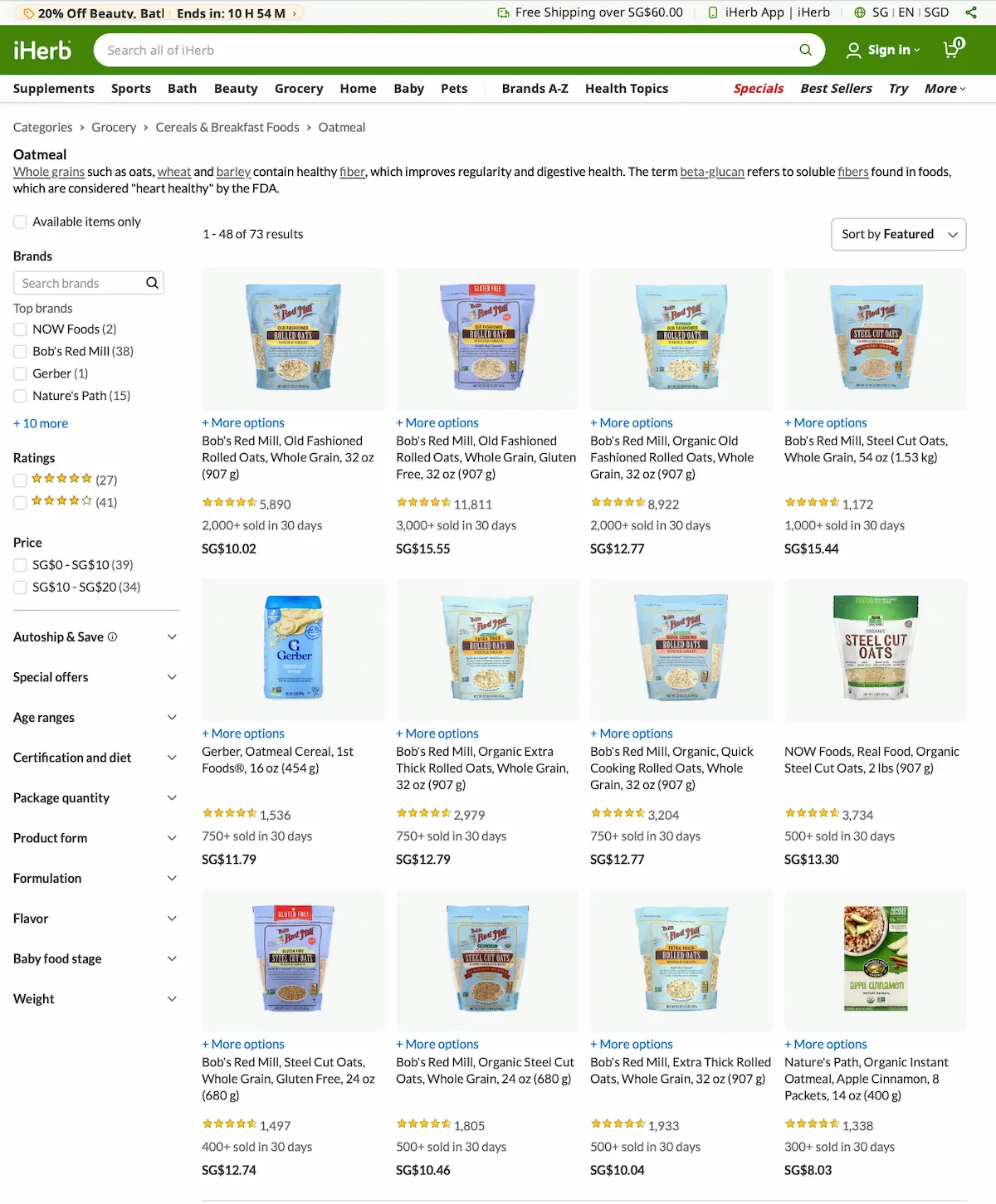
5 ways to achieve unity in your designs
Now that you understand the essential elements, let’s explore the specific techniques you can use to implement unity in your work!
These five methods are the most effective ways to create cohesive designs that feel intentional and professional.
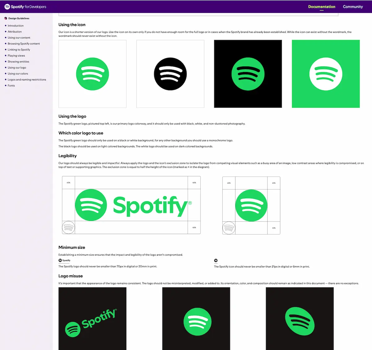
1. Unity through repetition
Repetition creates rhythm and consistency by repeating visual elements throughout your design. Use the same button style, repeat color accents strategically, maintain consistent icon styles, and apply uniform image treatments.
Spotify’s design and branding guidelines demonstrate this with their consistent green accent color, rounded corners on all images, unified typography system, and consistent spacing between elements.
2. Unity through proximity
The way you group and space elements communicates relationships and creates visual organization that supports unity.
Proximity groups related elements together, creating unity through organization. Group related information, create white space between sections, use consistent spacing, and align elements to show relationships.
E-commerce sites use this effectively by grouping product images together, placing price and purchase options nearby, and clustering related products below main content.
3. Unity through alignment
Strong alignment systems create invisible guidelines that connect all elements, even when they’re physically separated. You can use grid systems, create invisible guidelines, maintain consistent margins, and align text baselines to establish professional-looking structure.
The CDC page on high blood pressure is a good example. They have a consistent left-aligned layout with clear content blocks. Everything aligns with invisible vertical guidelines – the headers, body text, bullet points, and images all follow the same left margin alignment.
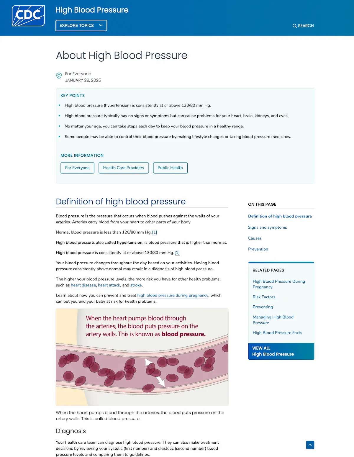
Plus, all headers (“Definition of high blood pressure,” “Diagnosis,” “Signs and symptoms”) align to the same left edge, creating visual connection points down the page. The body text maintains consistent left alignment with predictable line spacing.
The blood pressure illustrations and tables are also positioned to align with the text grid, not randomly placed. They integrate into the alignment system rather than breaking it.
4. Unity through color
Color is your most powerful unity tool because it works instantly and emotionally to connect disparate elements. Limit your palette to 3-4 colors, use the 60-30-10 rule, apply colors consistently, and create harmony through complementary colors.
5. Unity through style
Consistent visual treatment across all elements signals intentionality and professionalism to your audience.
Maintain consistent style across all design elements, including image treatments, icon design, typography choices, and graphic elements. This creates immediate visual cohesion.
Real-world examples of unity in design
Here are some example of design unity in action:
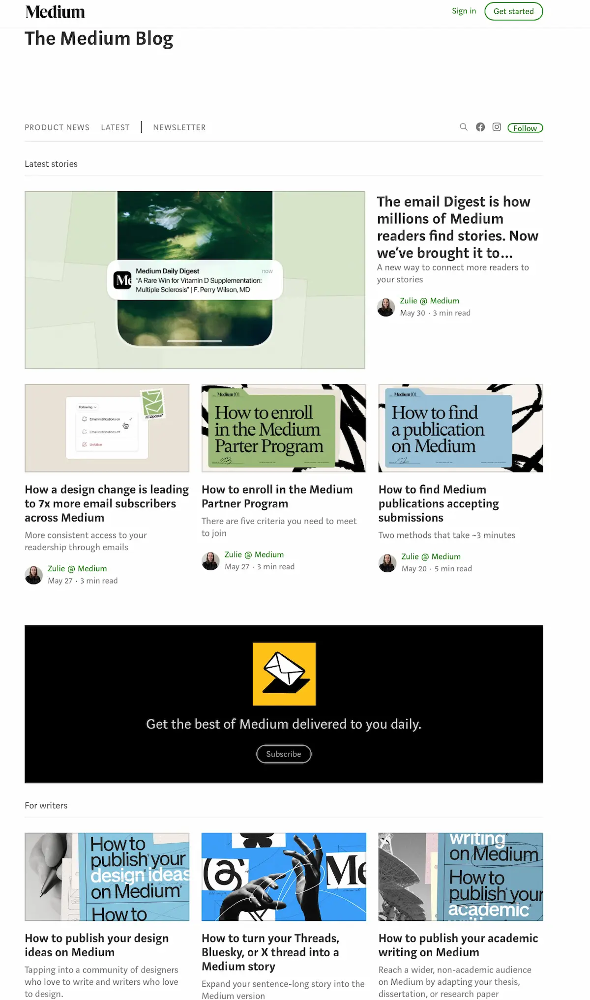
Web design
Medium.com achieves unity through consistent typography, strategic white space, aligned grid systems, and a minimal color palette that creates a seamless reading experience.
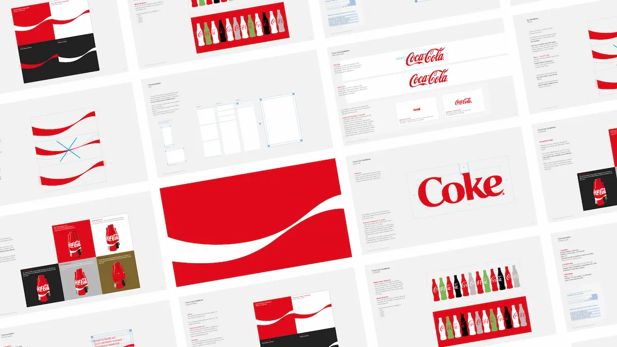
Branding
Coca-Cola maintains unity across all media through their iconic red and white color scheme, consistent script typography, and unified bottle silhouette. Want to accomplish this for your brand too? Start by creating your brand guidelines.
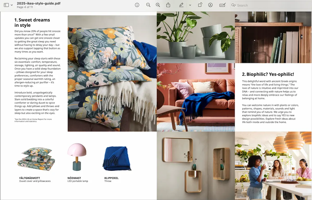
Print design
IKEA’s catalog demonstrates unity through Scandinavian minimalism, consistent photography angles, unified color coding systems, and grid-based layouts. Check out their 2025 style guide.
Master design unity with discipline, not talent (and with Piktochart too!)
Unity transforms amateur work into professional design by ensuring every element works together to create one cohesive vision. It’s not just about talent though. It boils down to discipline in following consistent principles and maintaining unity in your design choices.
Ready to create unified designs quickly?
Get your free Piktochart account and start with professionally-designed templates that already incorporate unity principles. Pick a template, customize it while maintaining the built-in consistency, and watch your ideas transform into cohesive, professional designs!
Frequently asked questions about unity in design
What’s the difference between unity and balance in design?
Balance focuses on distributing visual weight evenly across your design to create stability. Unity ensures that all elements—whether balanced or not—feel like they belong together and support the same overall message. You can have perfect balance without unity, but the design will still feel disjointed.
Can a design have too much unity?
Yes, excessive unity can make designs feel boring or monotonous. The key is finding the right balance—maintain enough unity for cohesion while allowing strategic contrast and variation to create visual interest. Use the 80/20 rule: 80% unity with 20% intentional contrast.
How do I maintain unity across multiple pages or designs?
Create and stick to a style guide that defines your colors (60-30-10 rule), typography (maximum 2 fonts), spacing (8px grid system), and alignment rules. Apply these consistently across all pages while allowing minor variations for different content types or purposes.
What’s the biggest mistake beginners make with unity?
The most common mistake is inconsistency such as using too many fonts, colors, or spacing values. Beginners often think more variety equals better design, but the opposite is true. Start with severe restrictions (2 fonts, 3 colors, 1 grid system) and only add complexity when you’ve mastered the basics.
How long does it take to achieve good unity in design?
With the right system, you can achieve basic unity immediately using the 5-minute implementation formula. However, developing an eye for unity and knowing when to break the rules takes practice. Focus on consistency first. After all, it’s better to be consistently simple than inconsistently complex.
Should I break unity rules for emphasis?
Yes, but strategically. Breaking unity rules can create powerful emphasis, but only when the rest of your design follows unified principles. Think of it as controlled rebellion—the exception proves the rule. Use this technique sparingly and purposefully.